
Components
This is an overview of useful Protostrap components.
Components help you speed up your prototyping. Simply copy the code snippets below and paste them in your code.
Twitter Typeahead
<span class="form">
        <input type="text" class="form-control typeahead" name="mytypeahead" placeholder="Typeahead (Try: foo)">
</span>Getting the data into the typeahead
The file snippets/typeahead.php contains everything that Typeahead needs:- The source data: this is the data that is searched and suggested by Typeahead
- The display: All the templates that Typeahead needs, for the suggestions, the footer and in case no entries are found.
- The callback: defining what happens once an entry is selected.
The source data can be any form of object. The keys (name and price) can be chosen freely. You can also have more or fewer keys, Typeahead is very flexible in this respect.
var sourcedata = {
    0: {name:'foo bar', price:'6.99'},
    1: {name:'foo fighters ticket', price:'12.49'},
    2: {name:'a fools errand', price:'18.00'},
    3: {name:'football', price:'26.49'}
};The display and callback are taken care of in this block, which is divided int the segments Typeahead options, Typeahead source and templates and Typeahead callback
// Typeahad options
$('.typeahead').typeahead({
  highlight: true,
  minLength: 1
},

// Typeahead source and templates
{
  source: substringMatcher(sourcedata),
  templates: {
    notFound: '<p class="tt-noentries" ><strong>No entries found</strong></p>',
    footer: '<p class="tt-footer" >
                  <button class="btn btn-default">Show all results</button>
             </p>',
    suggestion: function(data){
          return '<p class="topborder">
                       <strong>' + data.name + '</strong>
                       <span class="pull-right">$' + data.price  + '</span>
                  </p>';
        }
    }
})

// Typeahead callback
.on('typeahead:selected', function (event, selected) {
    console.log(selected.name);
    console.log(selected.price);
});Stepper
<div class="stepper">
  <!-- Stepper: Steps -->
  <ul class="steps">
    <li id="step-tab-1" data-target="#step1" class="active">
      <span id="badge1" class="label label-as-badge label-info">1</span>
      Step 1
      <span class="chevron"></span>
    </li>
    <li id="step-tab-2" data-target="#step2">
      <span id="badge2" class="label label-default label-as-badge">2</span>
      Step 2
      <span class="chevron"></span>
    </li>
    <li id="step-tab-3" data-target="#step3">
      <span id="badge3" class="label label-default label-as-badge">3</span>
      Step 3
      <span class="chevron"></span>
    </li>
    <li id="step-tab-4" data-target="#step4">
      <span id="badge4" class="label label-default label-as-badge">4</span>
      Step 4
      <span class="chevron"></span>
    </li>
  </ul>
  <!-- Stepper Content -->
  <div class="step-content">
    <!-- Step 1 -->
    <div class="step-pane step-pane-1 active" id="step1">
      <a class="btn btn-primary btn-next"
         data-nextid="2" type="button" href="javascript:void(0);">
         Next
      </a>
    </div>
    <!-- Step 2 -->
    <div class="step-pane step-pane-2 " id="step2">
      <a class="btn btn-default btn-prev "
         data-previd="1" type="button" href="javascript:void(0);">
         Previous
      </a>
      <a class="btn btn-primary btn-next"
         data-nextid="3" type="button" href="javascript:void(0);">
         Next
      </a>
    </div>
    <!-- Step 3 -->
    <div class="step-pane step-pane-3 " id="step3">
      <a class="btn btn-default btn-prev "
         data-previd="2" type="button" href="javascript:void(0);">
         Previous
      </a>
      <a class="btn btn-primary btn-next"
         data-nextid="4" type="button" href="javascript:void(0);">
         Next
      </a>
    </div>
    <!-- Step 4 -->
    <div class="step-pane step-pane-4 " id="step4">
      <a class="btn btn-default btn-prev "
         data-previd="3" type="button" href="javascript:void(0);">
         Previous
      </a>
    </div>

</div>Draggables
Sortable List
- 1
- 2
- 3
- 4
- 5
Sortable Grid
- 1
- 2
- 3
- 4
- 5
<!-- Sortable List -->
<ul class="list-group sortable list">
  <li class="list-group-item">1</li>
  <li class="list-group-item">2</li>
  <li class="list-group-item">3</li>
  <li class="list-group-item">4</li>
  <li class="list-group-item">5</li>
</ul>

<!-- Sortable Grid-->
<ul class="list-group sortable grid">
  <li class="">1</li>
  <li class="">2</li>
  <li class="">3</li>
  <li class="">4</li>
  <li class="">5</li>
</ul>Table filtering & sorting
In addition you can add sorting functionality.
| First Name | Family Name | Age |
|---|---|---|
| Anna | Zulu | 55 |
| Bruno | Alpha | 38 |
| Cherry | Bravo | 40 |
| Daniel | Charlie | 31 |
| Emma | Delta | 70 |
| Freddy | Echo | 33 |
| Gertrude | Foxtrot | 62 |
| Harry | Golf | 18 |
| Irma | Hotel | 26 |
| Johnny | India | 36 |
| Kaliope | Juliet | 19 |
| Lary | Kilo | 77 |
| Marky | Lima | 52 |
| Nora | Mike | 44 |
| Ofelia | November | 101 |
| Peter | Oscar | 64 |
| Quincy | Papa | 23 |
| Rachel | Quebec | 51 |
| Susan | Romeo | 55 |
| Tony | Sierra | 26 |
| Uma | Tango | 65 |
| Venus | Uniform | 61 |
| Walter | Victor | 36 |
| Xenia | Whiskey | 27 |
| Yanna | X-ray | 56 |
| Zoë | Yankee | 26 |
<table class="table filterTable tablesorter">
            <thead>
                <tr>
                    <th class="noWrap header">First Name</th>
                    <th class="noWrap header">Family Name</th>
                    <th class="noWrap header">Age</th>
                </tr>
                <tr>
                     <td><input type="text" class="filterSearch form-control" ></td>
                     <td><input type="text" class="filterSearch form-control" ></td>
                     <td><input type="text" class="filterSearch form-control" ></td>
                </tr>
            </thead>
            <tbody>
                <tr class="filterme ">
                    <td class="">Anna</td>
                    <td class="">Alpha</td>
                    <td class="">55</td>
                </tr>
                <tr class="filterme ">
                    ...
                </tr>
            </tbody>
        </table>
- Add the class filterTable to the <table> tag.
- Add the class filterSearch to the input field(s). This / these have to be in the table.
- Add the class filterme to the rows you want filtered
- Add the class tablesorter to the <table> tag.
Cards

Card title
A description of your card's content.
Card title
A description of your card's content.
Card title
A description of your card's content.
With more and more content
Card title
A description of your card's content.
<div class="card">
  <img class="card-img-top" src="..." alt="Card image cap">
  <div class="card-block">
    <h4 class="card-title">Card title</h4>
    <p class="card-text">A description of your card's content.</p>
  </div>
</div>Buttons on Card Images
-
Adding the class btn-togglePrimary will toggle the button between Primary and Default style
The heart, star and user icons will also toggle between outline and filled versions. Other icons will stay the same. - Adding the class btn-circle-sm will add a round button in a touchfriendly size
- Adding the class btn-circle will add a fairly big round button
- The buttons default position is in the top right corner. Adding one of the classes topLeft, bottomLeft or bottomRight, will move it to the respective corner
Star small round
A card with a round heart icon button that toggles to primary.
Classes used:
btn btn-default btn-circle-sm btn-togglePrimary btn-onCard
Default button small
A card with a small default button that toggles to primary.
Classes used:
btn btn-default btn-sm btn-togglePrimary btn-onCard
Default button on the bottom right
A default button positioned in the bottom right corner
Classes used:
btn btn-default btn-onCard bottomRight
<div class="card">
    <div class="btn btn-default btn-togglePrimary btn-circle-sm btn-onCard">
        <i class="fa fa-heart-o"></i>
    </div>
    <img class="card-img-top" src="..." class="img-responsive" alt="Image cap">
    <div class="card-block">
        <h4 class="card-title">Card title</h4>
        <p class="card-text">A description of your card's content.</p>
    </div>
</div>Toggle Password Visibility
<div class="input-group">
    <input type="password" class="form-control" name="pw" placeholder="Password">
    <span class="input-group-addon passwordToggle">
         <i class="fa fa-square-o"></i> Show
    </span>
</div>Fake Authentication Layer
Protostrap let's you define users and roles in the file assets/data/users.yml.
The structure of the file is straight forward. There is a section for users and one for roles.
users:
                        1:
                          fullName: Sara Default
                          email: one@company.com
                          username: sara
                          role: user
                        2:
                          fullName: Mara Admin
                          email: two@company.com
                          username: mara
                          role: admin
                        roles:
                        admin:
                          name: Admin
                          permissions: ['createData', 'editData', 'deleteData']
                        user:
                          name: Default User
                          permissions: ['editData']
                        guest:
                          name: Guest User
                          permissions: [ ]
Login
The default state of the prototype is that no user is logged in.To log in a user you can use the default login form.
The essential part of the form is the Email field. Protostrap will log the user in as long as the form that is submitted has a field with the name login.
<form action='' method='post' id="loginform">
            <div class="form-group">
                <label for="login">Email</label>
                <input id="login" name='login' class='form-control'
                       type='text' placeholder='Email' autofocus>
            </div>
            <div class="form-group">
                <label for="pw">Password</label>
                <div class="input-group">
                    <input type="password" class="form-control" name="pw"
                           placeholder="Password" >
                    <span class="input-group-addon passwordToggle">
                        <i class="fa fa-square-o"></i> Show
                    </span>
                </div>
            </div>
            <button type='button' class="btn-block btn btn-primary loginFirstUser"
    data-key="<?php getFirstUserLogin() ;?>">Log in</button>
        </form>
These are the Elements you need to know:
- Action attribute: If the forms action attribute is empty the current page is called.
- Autofocus attribute: This attribute in the Email field makes sure that the Email field is given focus on page load.
- loginFirstUser class: This class in combination with the data-key attribute will log in the fist user defined in the users.yml file
- getFirstUserLogin() function: calling this function gets the correct value for the first user defined in users.yml
User variables
Once a user is logged in Protostrap gives exposes a few variables you can work with:| $loggedIn | Tells you if a user is logged in. Returns false if not. |
|---|---|
| $justLoggedIn | Tells you if a user just logged in. This variable returns true only on the page called by the form. |
| $activeUser | An array of the current active user. Will show false if no user is logged in.
(You're currently not logged in. Log in to see the array) |
| $username | The active user's username |
| $usermail | The active user's email |
| $userrole | The active user's role |
| $userpermissions | An array of the permissions given to the user as defined in the users.yml file
(You're currently not logged in. Log in to see the array) |
Logout
If you want to keep the user on the current page you can add the parameter noredirect to the link.
<!-- Default Log out link -->
                <a href="?logout=true">Log out</a>
        <!-- Log out link without redirect -->
<a href="?logout=true&noredirect=true">Log out</a>Multilinguality
translations:
  thisIsAtest:             //  key
    en: This is a test     //  English Translation
de: Das ist ein Test // German TranslationYou have to pass the key parameter and can optionally pass a language parameter. If no language parameter is passed the current language is taken.
If a key can't be translated the key itself is show.
Example for the Key thisIsAtest:
| Active Language: | This is a test. |
| English: | This is a test. |
| German: | Das ist ein Test. |
| French: | thisIsAtest (Not available, returns the key) |
Active Language: <?php echo __("thisIsAtest"); ?>
English: <?php echo __("thisIsAtest","en"); ?>
German: <?php echo __("thisIsAtest","de"); ?>
French: <?php echo __("thisIsAtest","fr"); ?> (Not available, returns the key)Fake Google
Protostrap has a file google.php. When called it shows a page very similar to the Google start page. Users can perform searches and the results are real google search results.
-
Heads up!
Google restricts the free searches over their Custom Search API to 100 searches per day. Therefore the search result page above displays alwas the same static result page.
Redirecting to the Prototype
The Google results really come from Google. Although: they are not requested through the users browser but through Protostrap itself. So the results pass though Protostrap before being shown to the user.
Just passing on the list to the users would not make much sense. After all you want to find out how the users react to the prototype.
Protostrap let's you define URLs that it will change to point to the prototype instead.
All the data needed is in the file fakeGoogle.yml in the folder assets/data. The file must contain your credentials to Google's custom search. If you haven't already you need to sign up for Google Custom Search to get the credentials.
Besides the call parameters you have to define the URLs that you want to replace and what they should be replaced with.
google:
  callParameters:
    cx: "YOUR-CS-IDENTIFICATION"
    key: "YOUR-API-KEY"
    gl: "uk" #country code

  urlsToReplace:
    1: "http://www.example.com"
  replacements:
1: "index.php"In the example above Protostrap would also replace the link http://www.example.com/category/ since the url to replace is contained in the link.
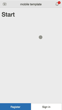
Page Transitions
Protostrap comes with a template for page transitions. The file template_mobile.php contains all you need to get your app-like project off the ground.
Page transitions has these elements:
- Pages: These are bundled in a container with the id pt-main. Each page has an id that starts with page- and ends with an unique identifier. This identifier is used to locate the corresponding top- and tabbar
- Topbars: These are bundled in a container with the id topbarContainer. The topbars can contain any content you like. Protostrap provides examples with icons and labels
- Tabbars: These are bundled in a container with the id tabbarContainer. The tabbars are typically made up of buttons. Protostrap also provides a iOS like tabview navigation with icons, labels and badges
- Transition starters: You can initiate transitions with any element that has the class goto, the attribute data-goto and the attribute data-animation.
The data-goto value has to be the identifier of an existing page inside pt-main. The animation value is one of the following:
moveInFromRight, moveInFromLeft, moveInFromBottom, moveInFromTop, moveOutFromTop, moveOutToRight, moveOutFromRight,
<!-- T O P B A R S -->
<div class="topbarContainer ">
    <div id="topbar-start" class="flexbox topbar topbar-current">
        <div class="fix80" >
            <a href="javascript:void(0);" class="goto btn"
                data-goto="camera" data-animation="moveInFromBottom">
                <i class="icon ion-ios-camera-outline topbar-icon"></i>
            </a>
        </div>
        <div class="flex-1 align-center">
                <span class="topbar-title">mobile template</span>
        </div>

        <div class="fix80 align-right" >
            <a href="javascript:void(0);" class="goto btn"
                data-goto="notifications" data-animation="moveInFromRight">
                <i class="icon ion-ios-bell-outline topbar-icon"></i>
                <!-- You can add badges to topbar elements -->
                <span class="topbar-badge">1</span>
            </a>
        </div>
    </div>

    <div id="topbar-notifications" class="flexbox topbar">
        <div class="fixed-size-120" >
            <a href="javascript:void(0);" class="btn goto"
                data-animation="moveOutFromRight" data-goto="start">
                <i class="icon ion-ios-arrow-back topbar-icon"></i>
            </a>
        </div>
        <div class="flex-1 align-center">
            <span class="topbar-title">Notifictions</span>
        </div>
        <div class="fixed-size-120 align-right" >

        </div>
    </div>
</div>


<!-- T A B B A R S -->
<div id="tabbarContainer" class="tabnavbar navbar-default navbar-fixed-bottom transparent ">

    <div id="tabbar-start" class="flexbox tabbar tabbar-current">
        <div class="flex-1">
            <button class="btn btn-primary btn-block goto "
                data-animation="moveInFromLeft" data-goto="page2">Register</button>
        </div>
        <div class="flex-1">
            <button class="goto btn-block  btn btn-default"
                data-animation="moveInFromTop" data-goto="page3">Sign in</button>
        </div>
    </div>


    <div id="tabbar-notifications" class="flexbox tabbar ">
        <div class="flex-1">
            <button class="goto btn-block  btn btn-primary"
                data-animation="moveInFromleft" data-goto="start">Go back</button>
        </div>
    </div>


    <!-- Pages with no tabbar habe a hidden tabbar -->
    <div id="tabbar-camera" class="flexbox tabbar hide"></div>

</div>

<!-- P A G E S -->
<div id="pt-main" class="pt-perspective">
    <div id="page-start" class="first-page pt-page container">
            <!-- Page Content -->
    </div>
    <div id="page-notifications" class="pt-page container ">
            <!-- Page Content -->
    </div>
</div>